Overview
Paziresh24 is an E-health platform help patients connect with the best Iranian doctors. Paziresh24 is the lead company as a patient appointment service in hospitals and has a dominant amount of users around Iran.
My Challenges
As a junior designer, I had the responsibility of redesigning the Paziresh24 website and application.
Research
Stakeholder Interview
In this research, I tried to understand the core value of the business and the main product bottleneck. So we make an online sheet ready and share it with stakeholders (CEO, CMO, CTO, PMs, and Support team manager) to get an overall detail about bad UX in products from their point of view so I clear and prioritize the sheet with help of PMs to get through the design process.
Competitor Analysis
Competitor analysis and benchmarking other online health platforms make our vision more clear about the future so every day I check some of paziresh24 Iranian and foreign competitors.
Foreign competitor: Practo, Veezeta, ZocDoc
Iranian competitor: DrDr, Dr Saina, Snapp Doctor, Pezeshket and etc (it was different for every market)
Persona
Who were our personas?
I decided to put my foot in users’ shoes to get to know their pain points, I use these health products every day to find the problem. but it was not the only way to empathize with the user so I come along with the support team to hear user messages, it helps me to understand their major problem (get healthy as soon as possible) and manor problem (such as hard to take an appointment from far cities) when they are using Paziresh24 health products. these were helped me to get to know our users.
Takeaways…
- Stakeholders were excluded from the design process, so the vision is unclear to the design teams
- Each product have its own components and library
- The current product is functional but not delightful to use
IT’S TIME TO DESIGN SOLUTIONS!
User Journey Map
Hopefully, Paziresh24 stakeholders have a clean customer and users journey map ready and with help of PMs, we had mapped the user’s story so I just had to design user flow of user stories and then I hand over the scenarios to the development team to implant and test them technically.
Wireframing
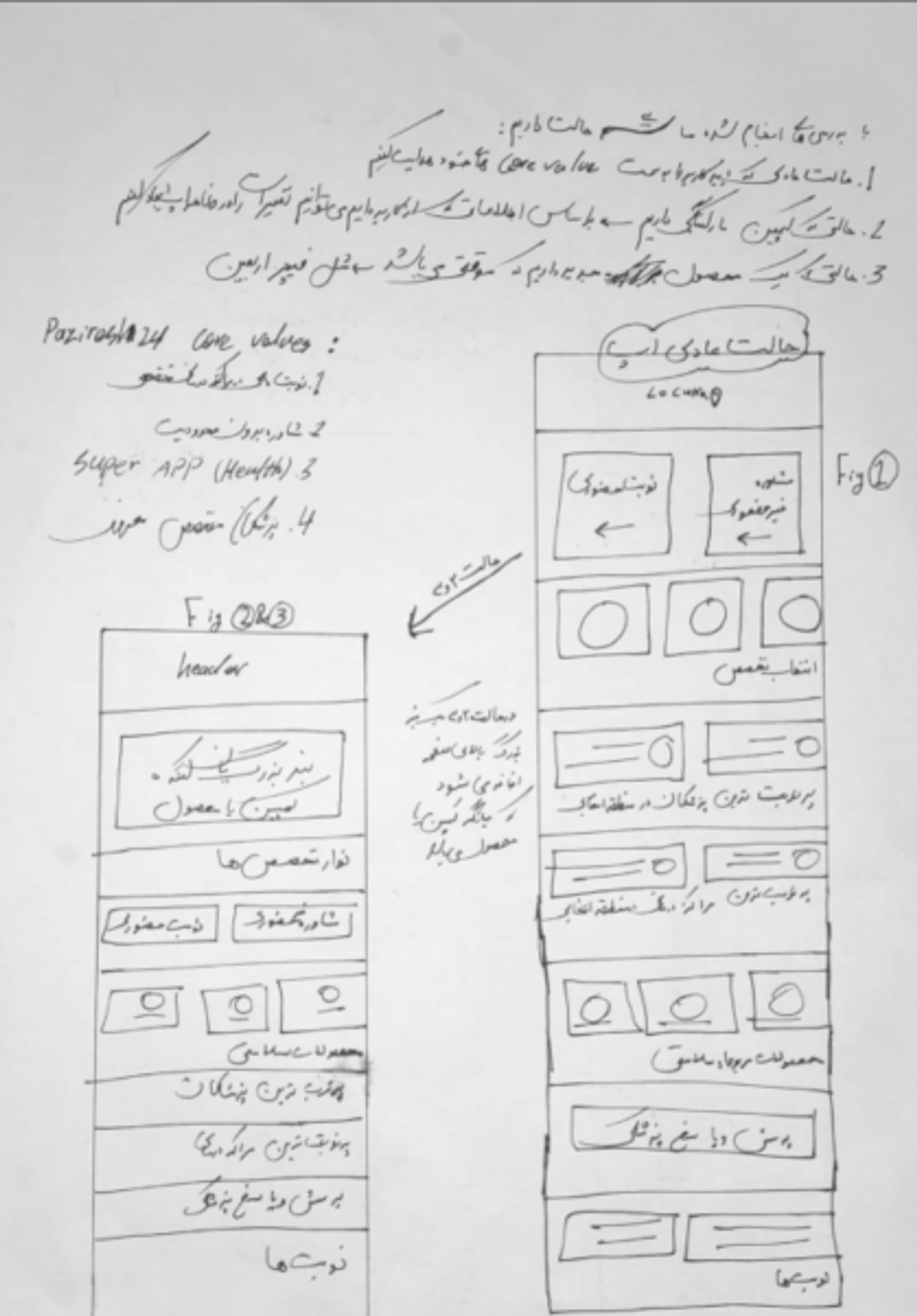
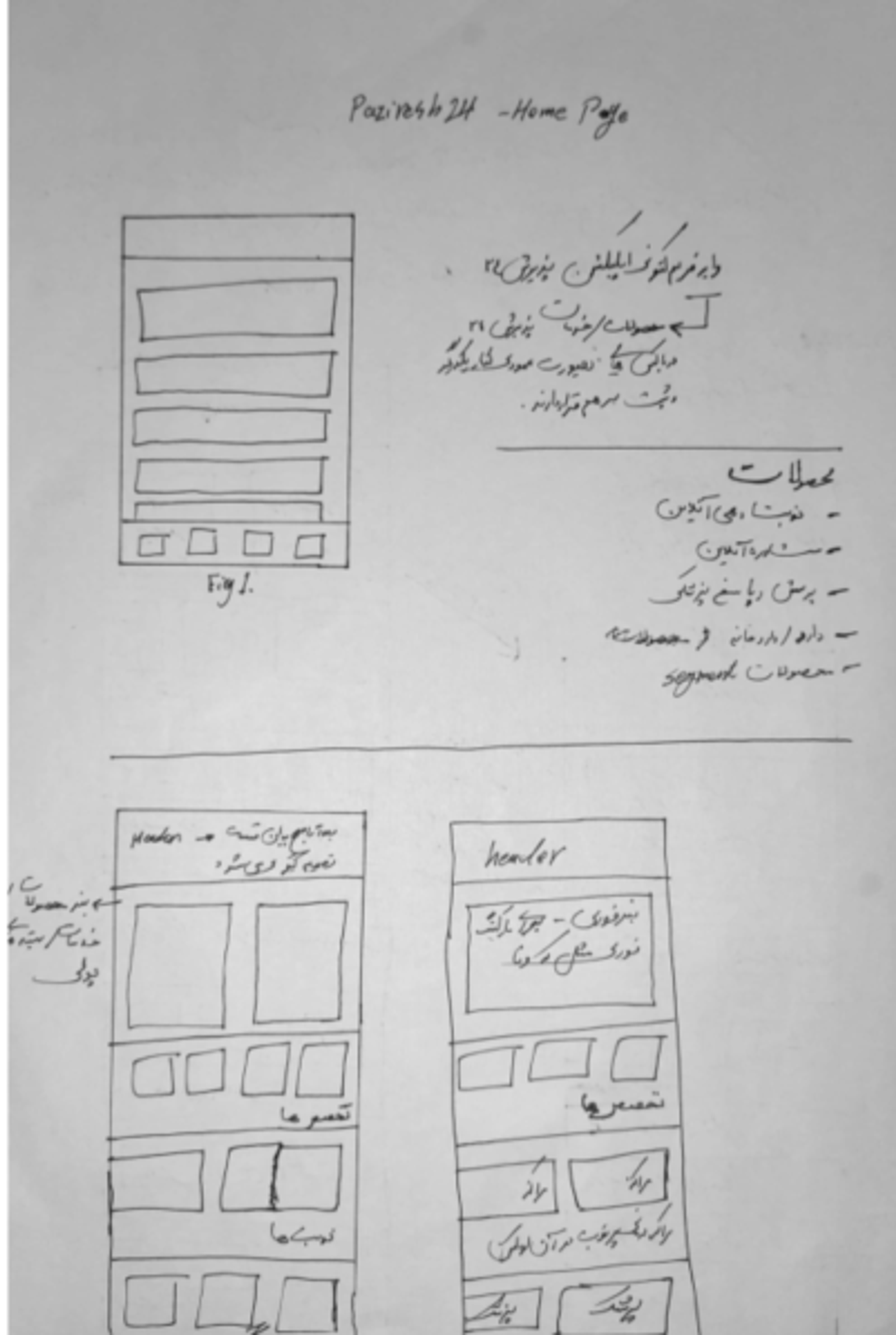
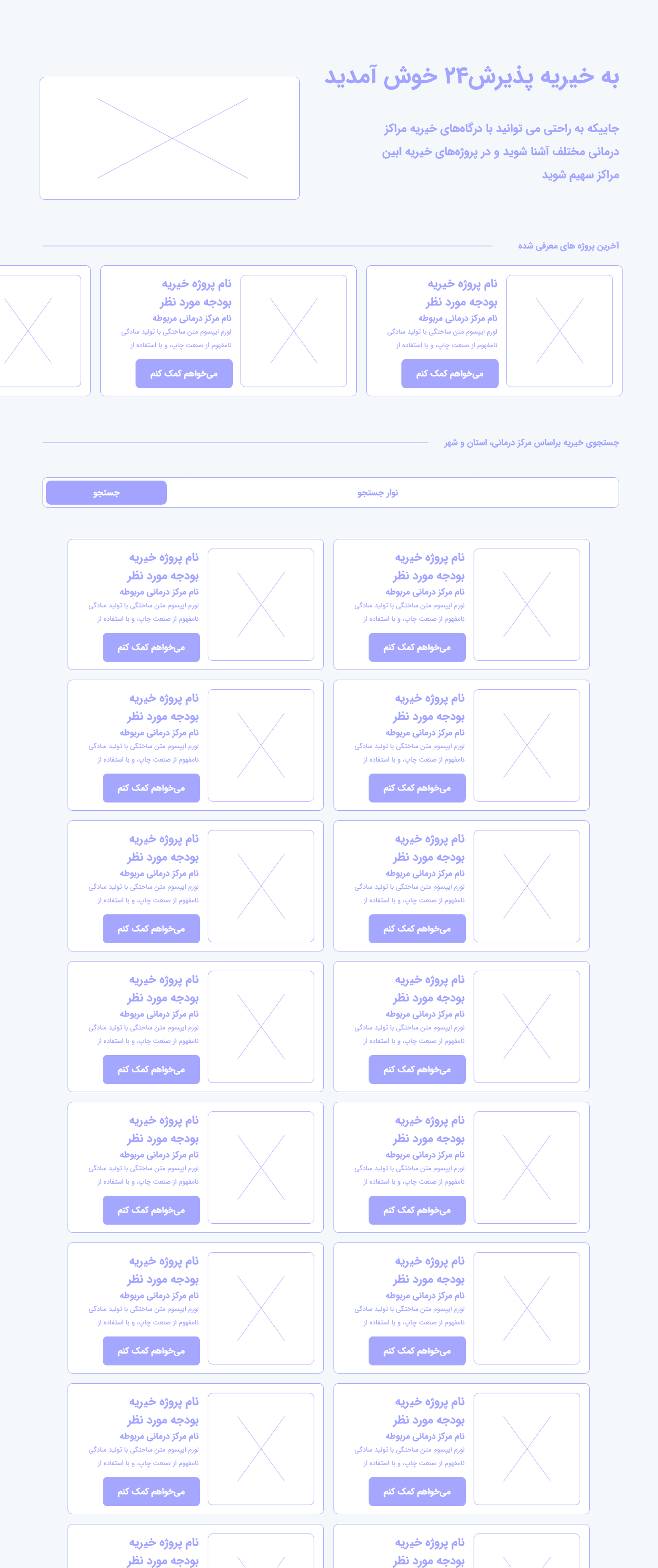

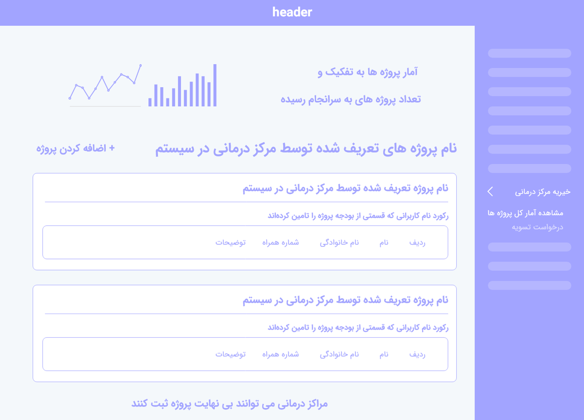
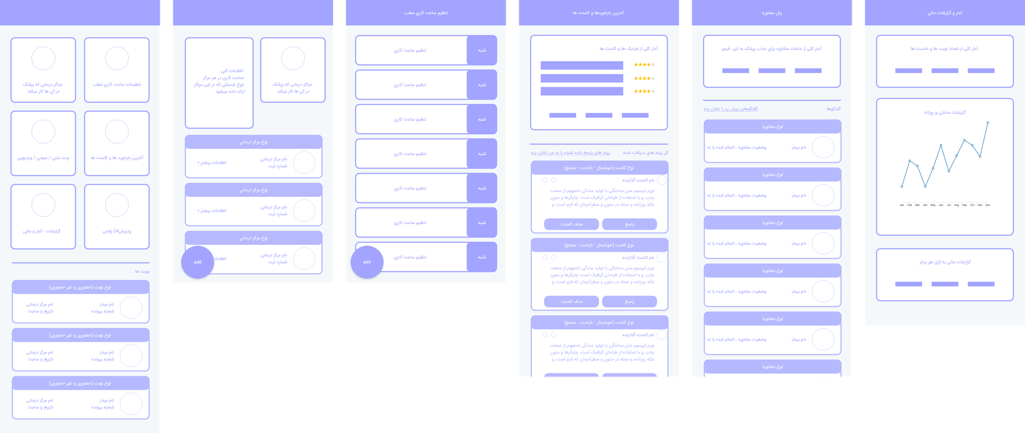
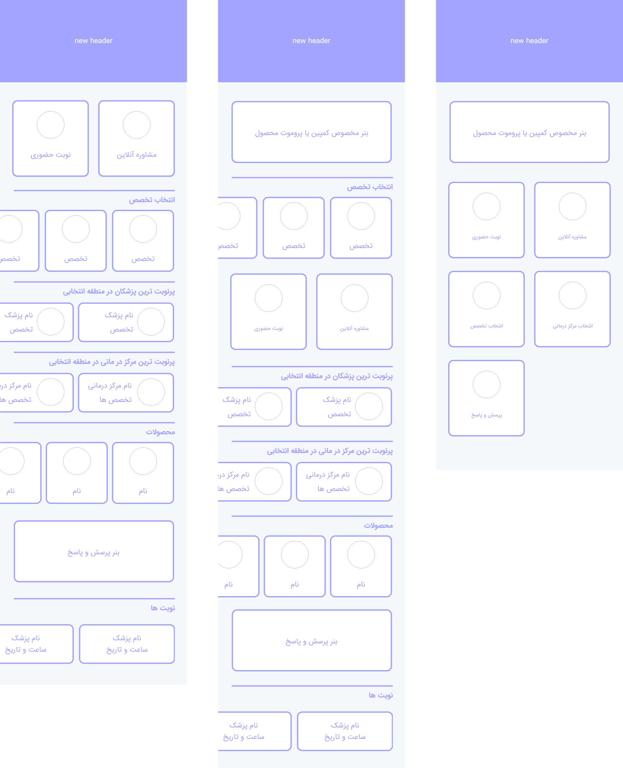
For Example,
I prepare multiple wireframes for the homepage of the app and the mobile version of the website to test.
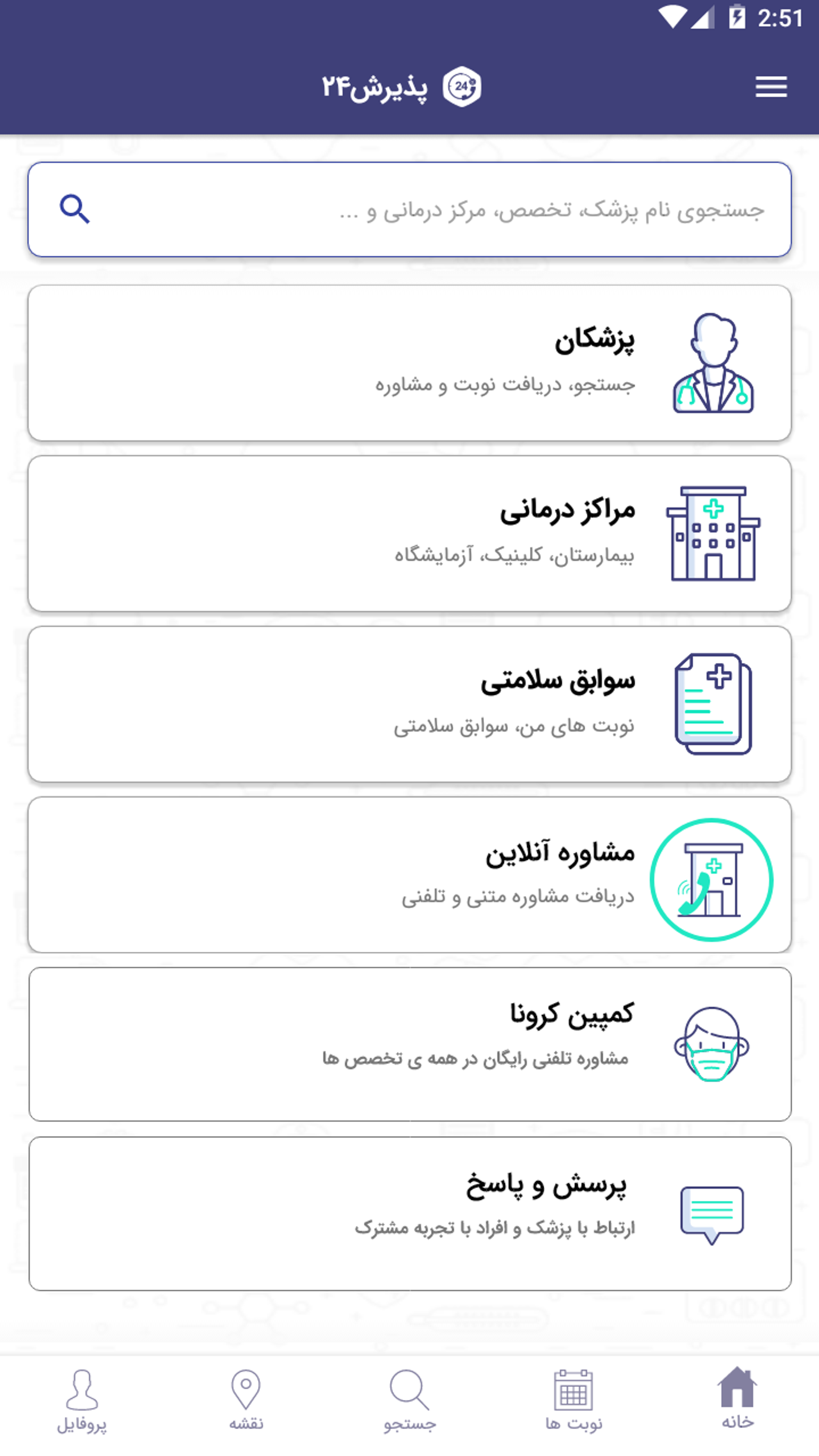
Application HomePage
In Homepage, we tried to present Paziresh24 as a Health super app that provides a solution for all aspects of health and is technically scalable

AND IT’S TIME TO ADD SOME BEAUTY 
I decided to redesign the style guide to improve the visual aspects of UI and document the Ui Kit for other designers.
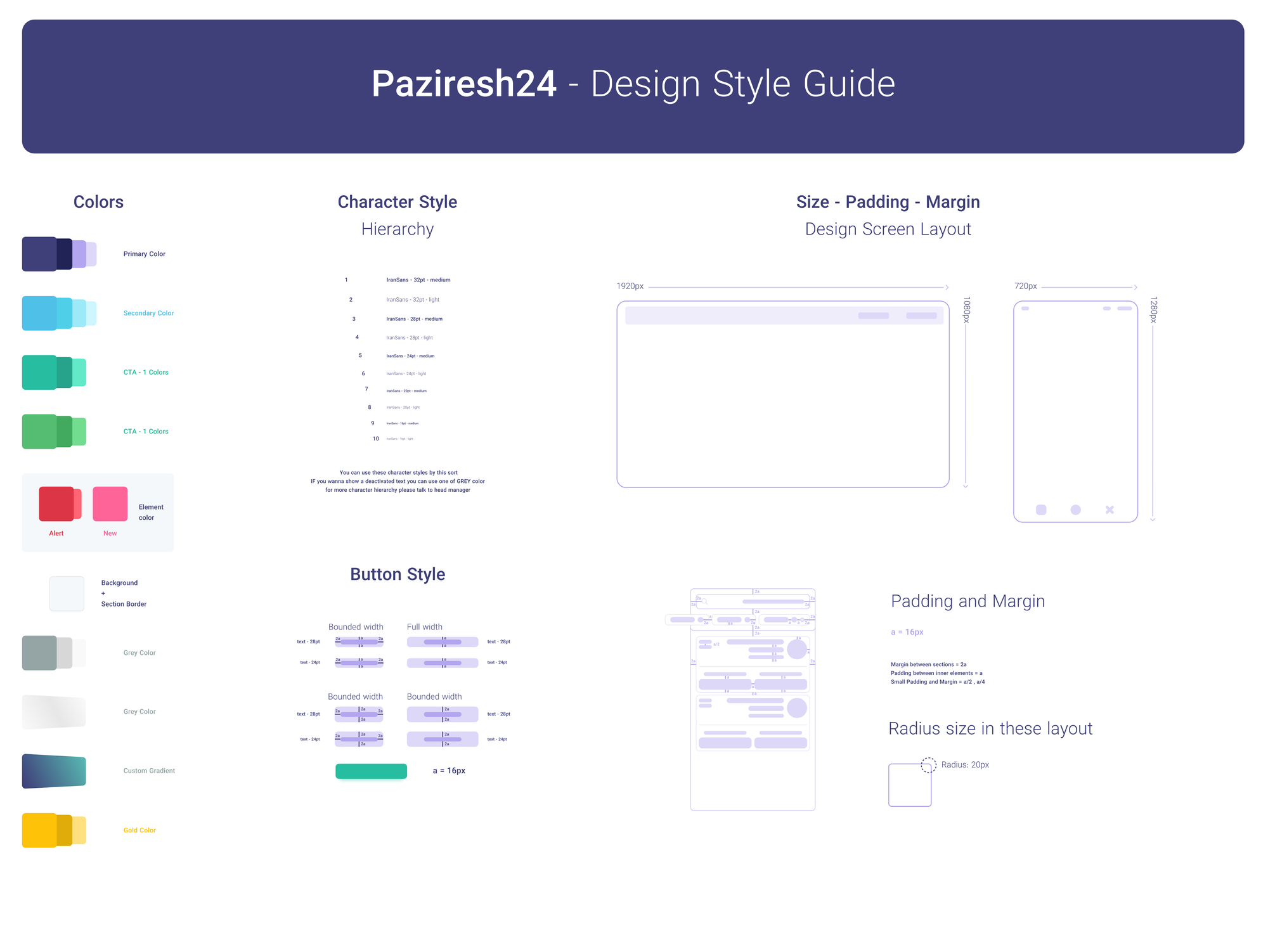
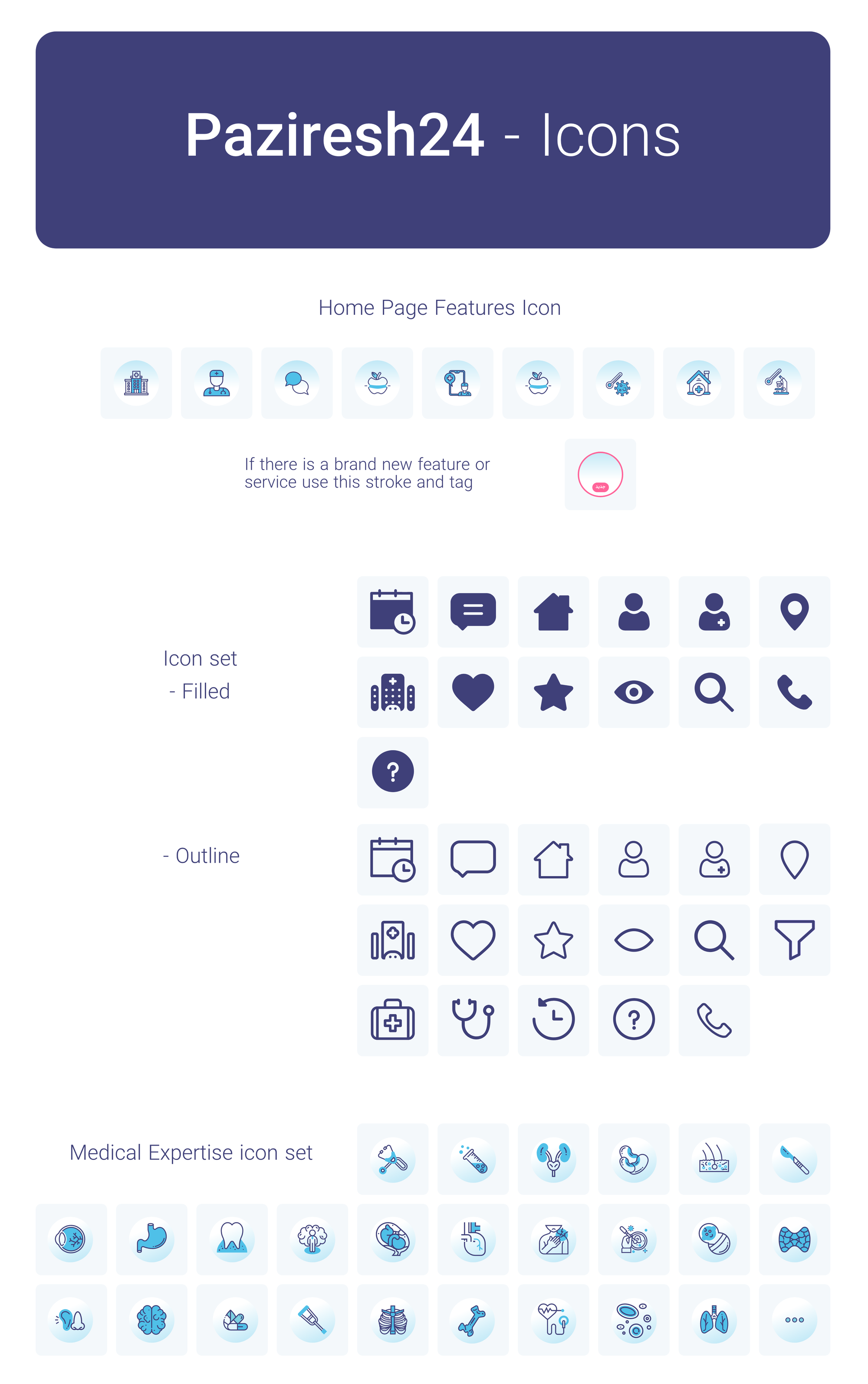
In this part, I invite you to see my Behance presentation for Paziresh24 project…

IN THE END, IT`S USERS THAT USE PRODUCTS…
User base: Around 1M
Impact on website
Active Users: +30% every month (At the time I was working there)
User base: +30% every month (At the time I was working there)
Other Impacts
After I designed the style guide and UI kit it helped other teams to use consistent components and increase their product delivery speed.
